Population Pyramids
Turlock's population would be slightly in-between stable and expanding slowly due to the slightly larger base compared to the middle section of the graph, meaning there would be more children replacing the older ages of citizens, causing the population to increase slowly.
This population would be described as constrictive due to the declining elderly population but an expansive middle age population.
In El Paso, the population would be expanding due to the larger base of the pyramid, being the younger children, and the slimmer mid and upper sections.
Miami's population would be classified as constrictive due to the much smaller elderly population near the top and the expansive mid section.
In Orlando, the population would be described as expanding and constricting due to the relatively large base of younger children as well as the expansive mid section of the graph, but a decreasing size of elderly population.
New York City's population would be best described as expansive due to the wider midsection over the slimmer upper section.
San Diego's population would be best described as constrictive, due to the wide mid section and relatively small lower section, not declining in population, but losing a majority of the elderly population.
Interesting Climate.gov Discoveries
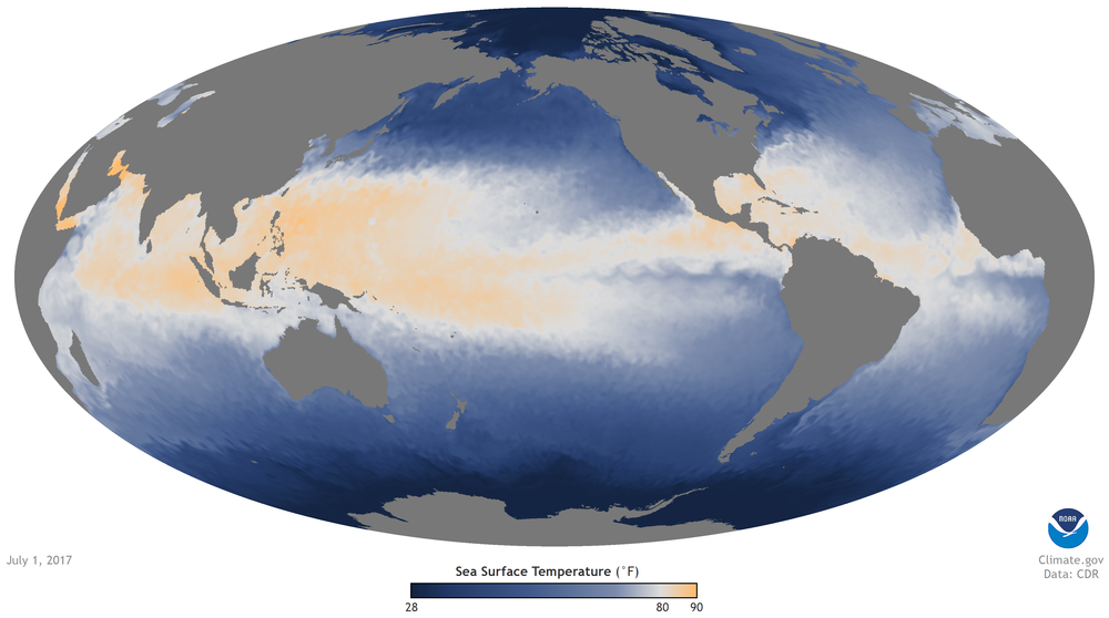
This first image shows the average surface temperature of the ocean's waters throughout the year. While the surface temperature of the ocean water remains fairly warm around the equator throughout the majority of the year, as the year progresses the waters around the South Eastern part of Asia begin to shift upward, causing the temperatures to increase in the the northern stretches of the ocean. In the months of July and August are where this shift is the most dramatic, cooling down in the later parts of the year.
|
|
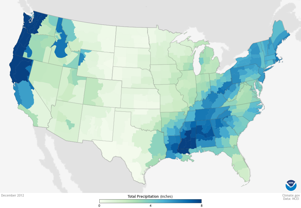
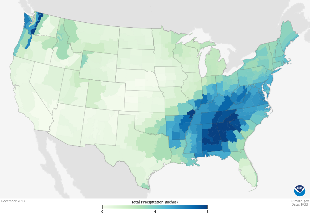
This second set of images is a collection of the total precipitation measured in a months time. In December of 2012, there was a considerable amount of rain for the western half of the United States, collecting over 8+ inches of rain, even in the eastern half of the U.S, stretching from Louisiana all the way to Maine. The following year, however, showed drastically different results, leaving the west coast almost completely dry and the northern parts of the east coast to a minimal amount of rain as well. This data is interesting simply due to the drastic change in rainfall in only a years time.
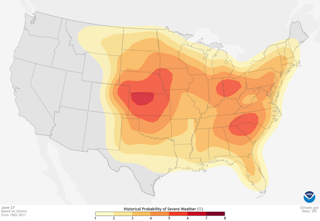
This third image is a collection of storm data from 1982 to 2011 which highlights the key months for the most severe weather events. This image is compiled on the date June 27th, which appears the be the peak day for the worst probability of storms or other severe weather occurrences in the year. These months of extreme weather seem to range from early May and die out around late July or early August. This data is particularly interesting because it highlights the seasonal events of the weather, being fairly peaceful in the early months of the year, but erupting in the middle months.
|
|
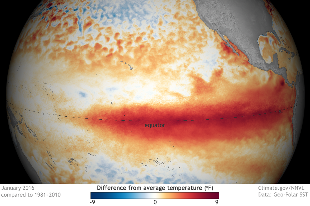
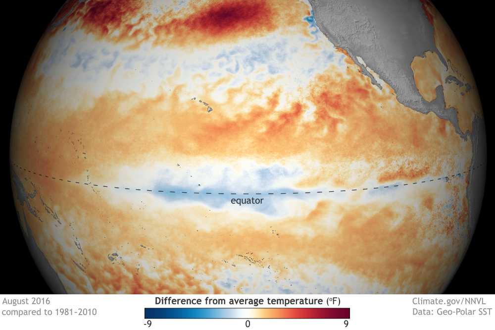
This fourth set of images is an analysis of the average temperatures around the world through a compilation of data and measurements made throughout the year. The first image is a reading taken in January, showing the hottest temperature around the equator but in the second image, which is a reading from August, this temperature drifts up away from the equator. This shows the seasonal changes of temperature due to Earth's rotation and orbit, heating the Earth differently as the year progresses.
|
|
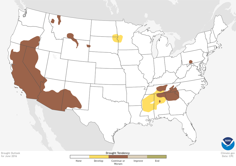
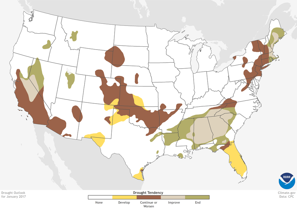
This last set of images is a measurement of water in the corresponding parts of the United States, highlighting the regions in which there was a severe lack of water, or drought. In June of 2016, a major drought stretched almost throughout the entirety of California. This caused an alarming response for everyone in California, due to the state being a major agricultural production state, leading to water conservation plans and other action in order to encourage citizens in California to reduce their own water usage. This was prevalent in neighborhoods, where watering plants was limited, and on a larger scale cities, where water was conserved greatly.
Positive and Negative Feedback Loops
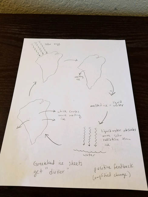
This first scenario regarding the dirt on the ice would be best represented through a positive feedback loop, increasing the overall value of change over time. In this scenario, the dirt causes the ice on the glacier to absorb more sunlight due to its darker color, causing more energy to be transferred to the surface rather than being reflected back into the atmosphere, which in turn cause the glacier to melt at a faster rate. This would increase over the following years do to the size reduction of the glacier, making it easier to melt the ice over time.
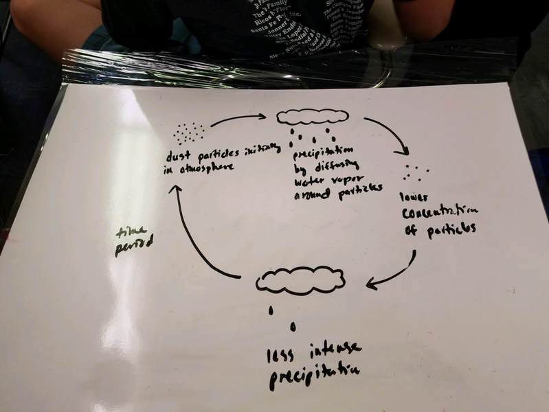
This second scenario describes the negative feedback loop of dust particles in the atmosphere and precipitation. Because of the dust particles in the atmosphere, precipitation is able to form and causes water droplets to fall onto the earths surface. When the raining period is over, there is a fewer concentration of dust particles in the atmosphere, causing a period of less intense precipitation until these dust particles resurface, most accurately describing a negative feedback loop.
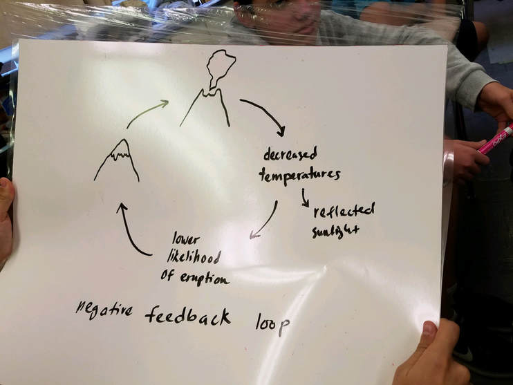
This third scenario involves the eruption of a volcano and its effects. As this volcano erupts, it emits bright clouds which, when released into the atmosphere, reflect a significant amount of sunlight back towards the sun rather than towards the surface, which would decrease surface temperatures. This, however, is not part of the described negative feedback loop, but it could contribute to other impacts. As a volcano erupts, its release of pressure and magma is dispersed into the air and onto the surface of the earth, displacing the total buildup of these factors that would contribute to an eruption. In order for another eruption to occur, there most be another buildup of these factors, meaning there would be a lower chance of another eruption to occur for a significant period of time, making it a negative feedback loop.
Species Diversity Lab
Car Lot #1 Data (Student Parking Lot)
docs.google.com/spreadsheets/d/1-o75-xXhaYwBD2A8J7-ioZzX_9ujamHsseV3UOkA81U/edit?usp=sharing
Car Lot #2 Data (Staff Parking Lot)
docs.google.com/spreadsheets/d/118_O_akS6WReGXdwhSDmvxRkAFZNdO8xRHjpqmMJcB8/edit?usp=sharing
Postlab Questions
1. The Shannon Diversity Index value for Car Lot #1, the student parking lot, is 2.3960. The value for Car Lot #2, the staff parking lot is 2.5038. This means that Car Lot #2 was more diverse. Although the first parking lot had a wider variety of cars, the majority of them were within 3-4 major car brands while in the staff lot, the frequency of each car was bigger on average for each car, making the second lot more diverse.
2. For the first lot, the most abundant car brand was Chevy and for the second lot, it was Ford. It is possible that Chevy could appeal more to the younger consumer and Ford for older consumers.
3. The max Shannon Index value for car lot one was 0.1947 and the minimum value was 0.0088. For the staff lot, the maximum Shannon Index value was 0.1636 and the minimum value was 0.0182.
4. For a mall parking lot, the Shannon Index Value would most likely be greater than these lots because of the greater frequency of cars of many different brands.
5. For a car dealership, however, the Shannon Index Value would be less than the school parking lots because most of the cars would be of the same brand because a dealer typically sells cars of the same brand, meaning there would be less diversity in the sample compared to a typical parking lot.
Wooly Worms Lab
1. What were the degrees of freedom used in this exercise?
There are six degrees of freedom.
3. What is the calculated chi-square (x^2) value?
40.06
4. Do your results indicate that it what chance alone that caused the unequal numbers of capture wooly worm phenotypes?
No, because our chi-squared value was 40.06, we can prove that it was not chance alone that caused the unequal numbers of captured wolly worm phenotypes.
5. Which colors of worms were subjected to a positive pressure? Which worms were subjected to a negative selection pressure?
Worms 7,5, and 1 were most likely subjected to positive pressure because they were the worms which were least collected throughout the lab. Worms 2,3,4, and 6 were most likely subjected to negative selection because they were the most likely collected worms throughout the lab.
6. What do these results indicate might happen over time to this wooly worm population?
Our results were different from our predicted outcomes of the lab because the lighter and fluorescent colored worms were actually the least likely collected throughout the lab while the darker colored worms were collected more frequently.
7. Consider feeding times, feeding habits, ability to see color, vision acuity, and other possible characteristics of predatory birds in nature. How might such characteristics determine selection of certain worm colors?
Certain phenotypes for predators and prey can cause species within a certain habitat to be more are less likely to survive. Color or camoflague of the species of prey is the biggest defense mechanism for survival. Species with other phenotypes such as beak size or other adaptations to that specific environment can also control the population of certain species, all factoring into the growth of a habitat.
8. Consider the school grounds upon which you "fed" on your wooly worms. If this particular environment remained unchanged over a very long period of time, how would the populations change? What would the community look like in ten years?
If the environment were to remain unchanged for ten years, the worms would most likely be settled in the safest spot in in the environment, most likely away from the concrete sidewalks and near the dirt patches of the trees and more towards the grass areas of the yard. The worms that would camoflague the best would most likely be the most adept to survive, while those who stick out within the environment would be the more susceptible to extinction.
